Pale Blue.
Brand identity and website for an independent, veteran-owned web design studio serving local businesses and government.
Download the brand guidelines PDF · 16 pages · 1.7 MB
Overview
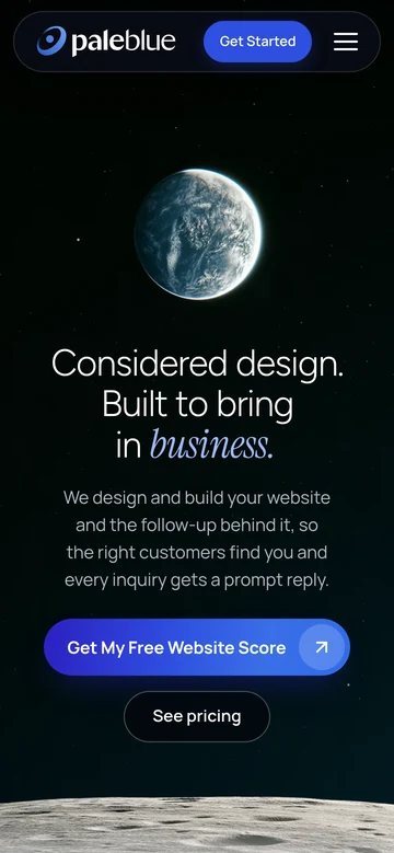
Seen by Voyager 1, Earth is a single pale blue dot, barely a pixel wide, alone in the dark. Carl Sagan called it the Pale Blue Dot.
That’s how the studio sees the businesses it builds for. The corner restaurant and the two-person moving crew aren’t small. They’re somebody’s whole world. Read the full story
The challenge
Most businesses are invisible online. Not because they aren’t great at what they do, but because their website doesn’t reflect it.
The studio itself had to clear the same bar: credible enough for government buyers, approachable enough for a local business owner, and fast enough to prove the point on any phone.
The approach
A calm, clear brand that puts the work first: one strong blue, plain language, and a fast site. Flat prices you see upfront, straight answers even when they cost us the work, and a finished site you own outright.
Because even on a pale blue dot, your business should be impossible to miss.
Identity





A two-weight wordmark: “pale” set heavy, “blue” set light, so the name reads as two words without a space. The mark is a pale blue dot inside a single orbit. In white on a blue tile, it’s also the site’s browser and home-screen icon. An all-white version sits on blue.
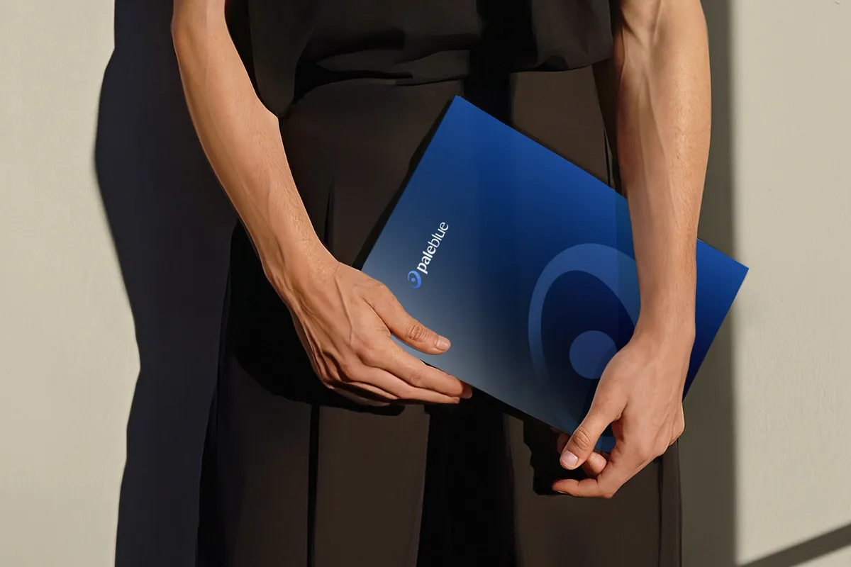
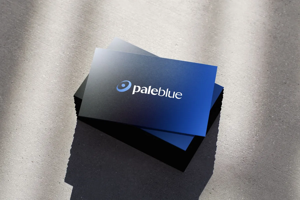
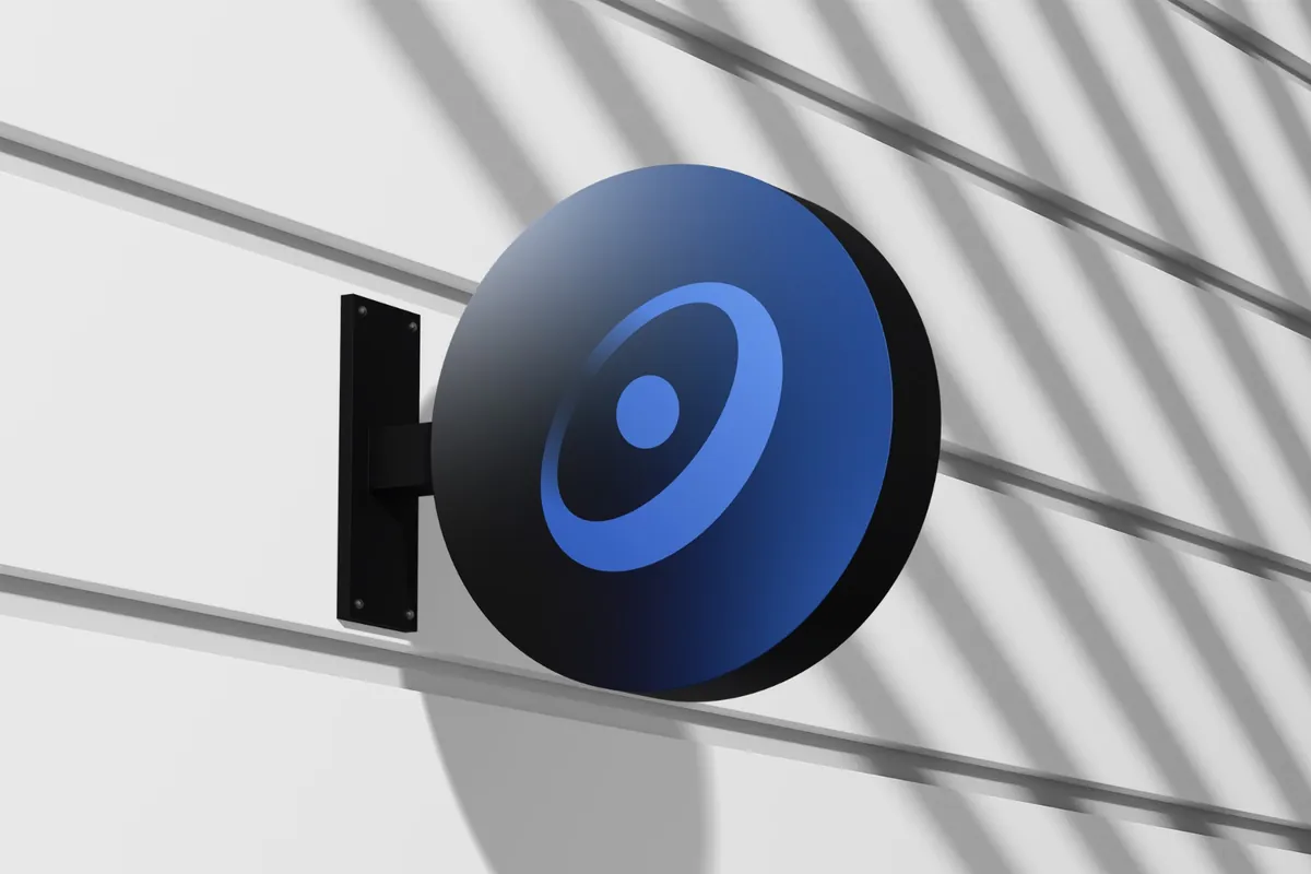
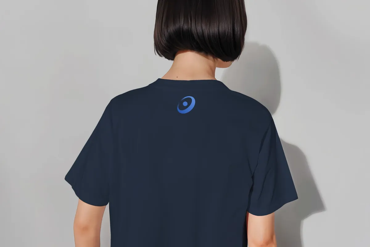
In use: folder, business cards, sign and apparel.
Color
#2F4FE0#0F172A#EAF1FC#FBFCFE#785A08#2C1FC2 → #2F6BEAFive core colors run the whole site, and a blend of blues marks the key words in headlines and the main buttons. Six accents are reserved for icons, and each passes 3:1 contrast on white.
Typography
Figtree Regular · Homepage headlineConsidered design. Built to bring in business.
Instrument Serif Italic · Accent wordbusiness. leads. customers. bookings.
Manrope SemiBold · Buttons and labelsGet My Free Website Score
Manrope Regular · BodyFlat rate. Fast turnaround. No fluff.
Figtree Light for headlines (Regular for the homepage’s, a touch firmer over the dark hero), with the key words in blended blues; Instrument Serif italic for the one word that changes in the homepage headline; Manrope for everything else. All three are self-hosted, so pages load fast and nothing comes from a third party.
Iconography
Solid icons, one accent each. The same idea always gets the same color: time and speed in orange, ownership and money in green, government in gold.
Interface
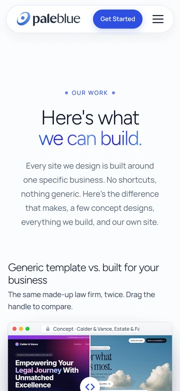
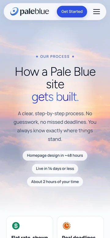
 Book a call
Designed phone-first. The menu bar stays at the top of every page, and on phones it opens into a menu card. The main button is one pill in blended blues with the arrow inside.
Deliverables
- Wordmark and light variant
- Browser icon
- Core palette and icon accents
- Type system
- Solid icon set
- Button and link styles
- Responsive website
- Work, process and brand pages
- Free website score tool
- Self-hosted, static build
Built the same way
we’ll build yours.
Flat rate. Fast turnaround. No fluff.